Adret on iPad, iPhone Duo and tablets: the poster on the left, the panels on the right
By Nicolas ·
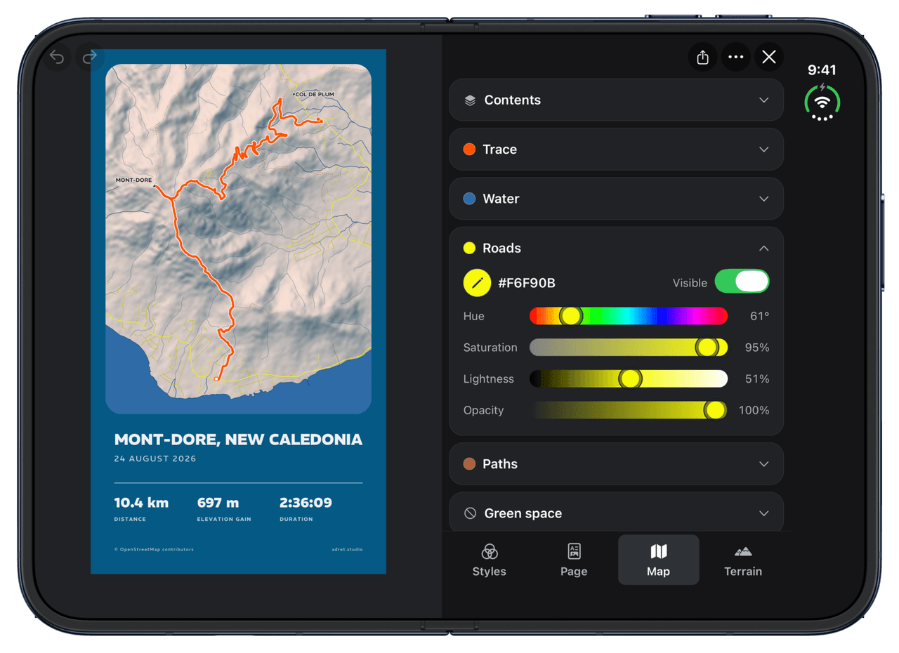
A poster no panel covers.
From version 1.2, Adret is made for iPad, iPhone Duo and Android tablets. Until now, on an iPad it was an iPhone app blown up: the same thing, only bigger.
On a phone there is no choice. The screen is narrow, so the panel that sets a colour sits on the poster, or under it. On a big screen held sideways, there is room to do better.
The column
Held sideways, the poster stands on the left, the full height of the screen, and the panels line up on the right, in a column as wide as a phone. Every control keeps the width it was designed for, and the poster does not move a pixel when you open one.
In the column, every entry is a card, in the order of the phone’s row. Closed, a card shows its name; tap it and it opens at its own height, and the one that was open closes. When the editor opens, everything is closed: the column starts as a list of what you can change.
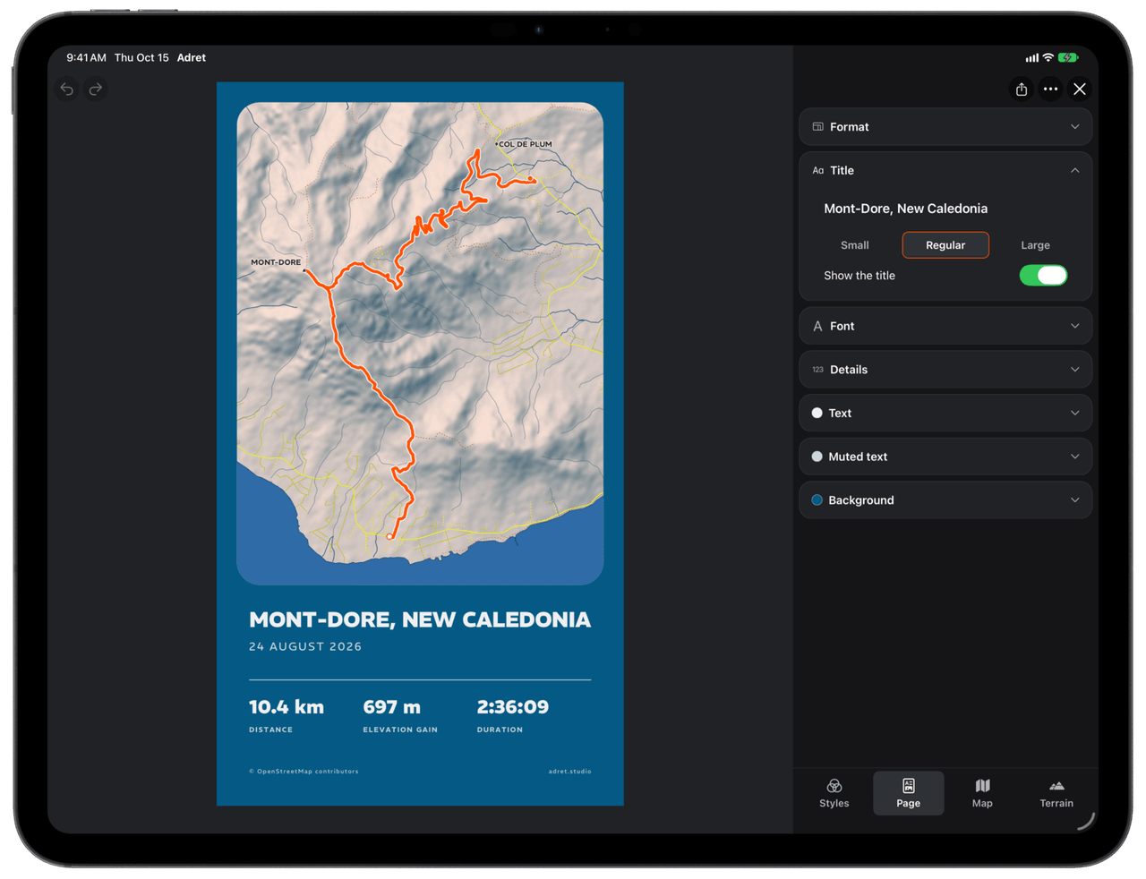
Upright, an iPad keeps the phone’s layout: its poster is already the size of a sheet of paper.
The iPhone Duo, folded, unfolded, half open
Folded, the iPhone Duo is an iPhone, and Adret behaves as it does on one. Unfolded and held sideways, it gets the iPad’s column. And it happens with the editor open: fold it, unfold it, and the poster settles back into place, the panel stays open and Undo remembers everything.
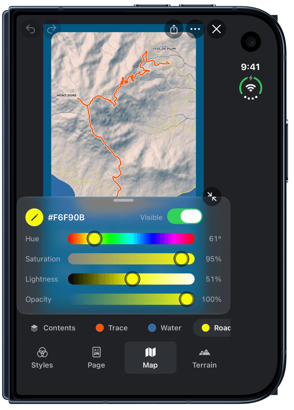
Adret follows the hinge too. Half open like a book, the iPhone Duo splits the screen on the fold: the poster on the left page, the panels on the right. Opened flat, it goes back to the column.
The size, not the device
Since iOS 27, an iPhone app can be resized like an iPad’s: a Stage Manager window, the iPhone Duo folded or unfolded, half its screen in Split View. So Adret does not look at which device it is running on, only at how much room it has: wide enough and landscape, it is the column; otherwise, the phone’s layout. That is also what Apple’s own checklist for the iPhone Duo asks for: it rules out a layout chosen by model.
One way out
One more change, on every device, iPhone included: the editor now takes the whole window. On an iPhone it used to open in a sheet, which you closed by swiping down. But a panel is put away with the same gesture, pulled down by the bar across its top: trying to put a panel away, you closed the whole editor. So the sheet is gone, and there is one way out: the button at the top right (and the Back gesture, on Android). Every change is saved as you make it, so closing loses nothing of the poster.
And on Android
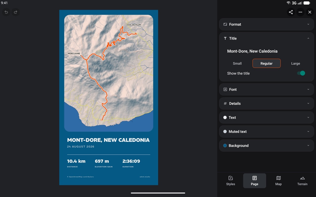
An Android tablet held sideways gets the same column. On a foldable Android phone half open, though, the screen is not split on the fold: on Android, Adret does not know where the fold runs, and lays the screen out by its size alone.
In short
None of this is Adret Pro: the column, the cards and the fold are for everybody.
- iPad and unfolded iPhone Duo, held sideways: the poster on the left, the panels in a column on the right.
- iPhone Duo half open like a book: the poster on one page, the panels on the other.
- Android tablet held sideways: the column, without the fold.
- iPad upright, folded iPhone Duo, iPhone: the phone’s layout.
- Everywhere: the editor takes the whole window, and closes with the button at the top right.
So, which screen do you finish your posters on?
Nicolas