The style is yours.
Start from one of Adret’s five styles, then change whatever you like. A style here is never a filter laid over a map: it is what the map draws, how the relief is lit, and every colour on the sheet.
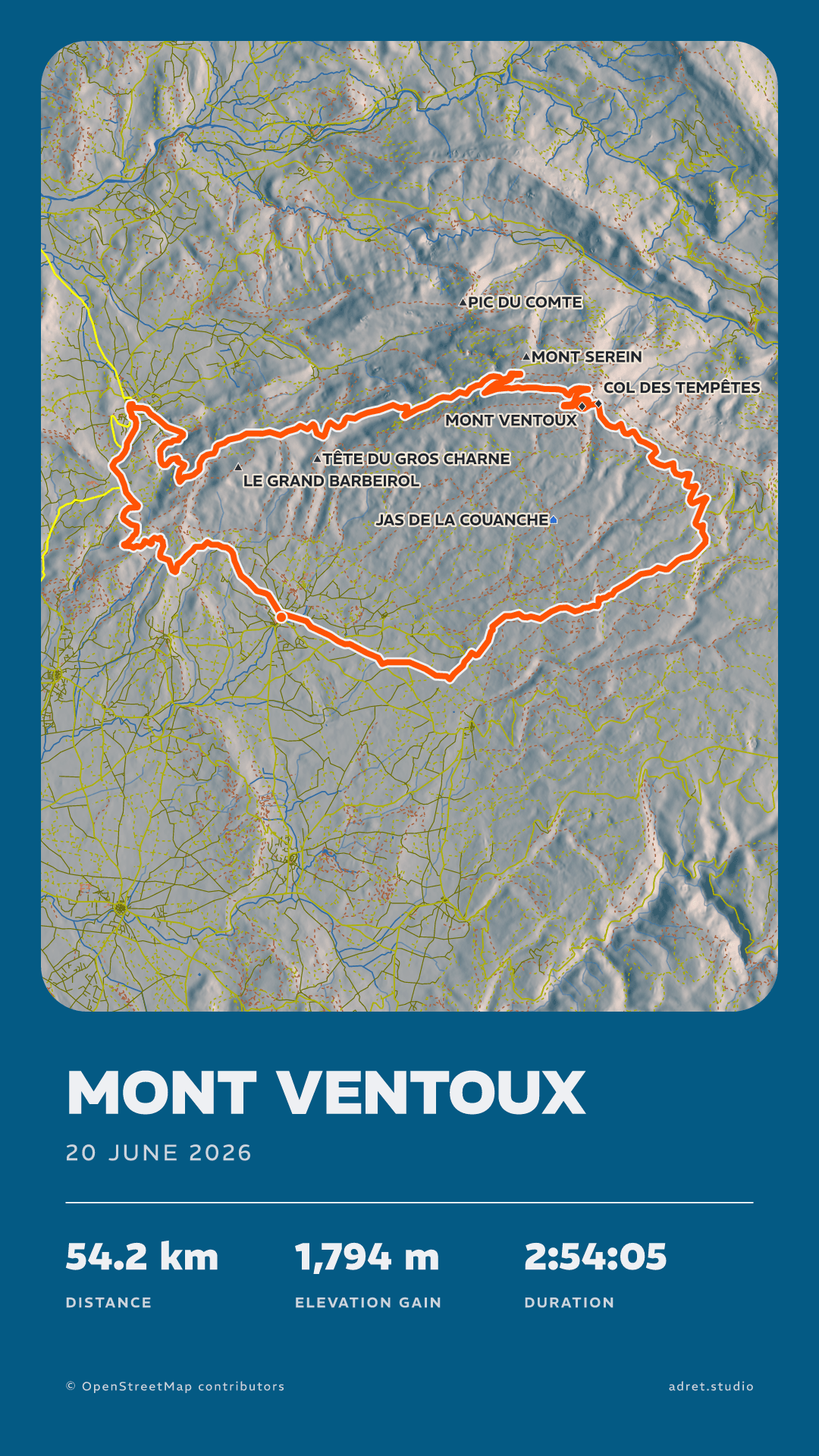
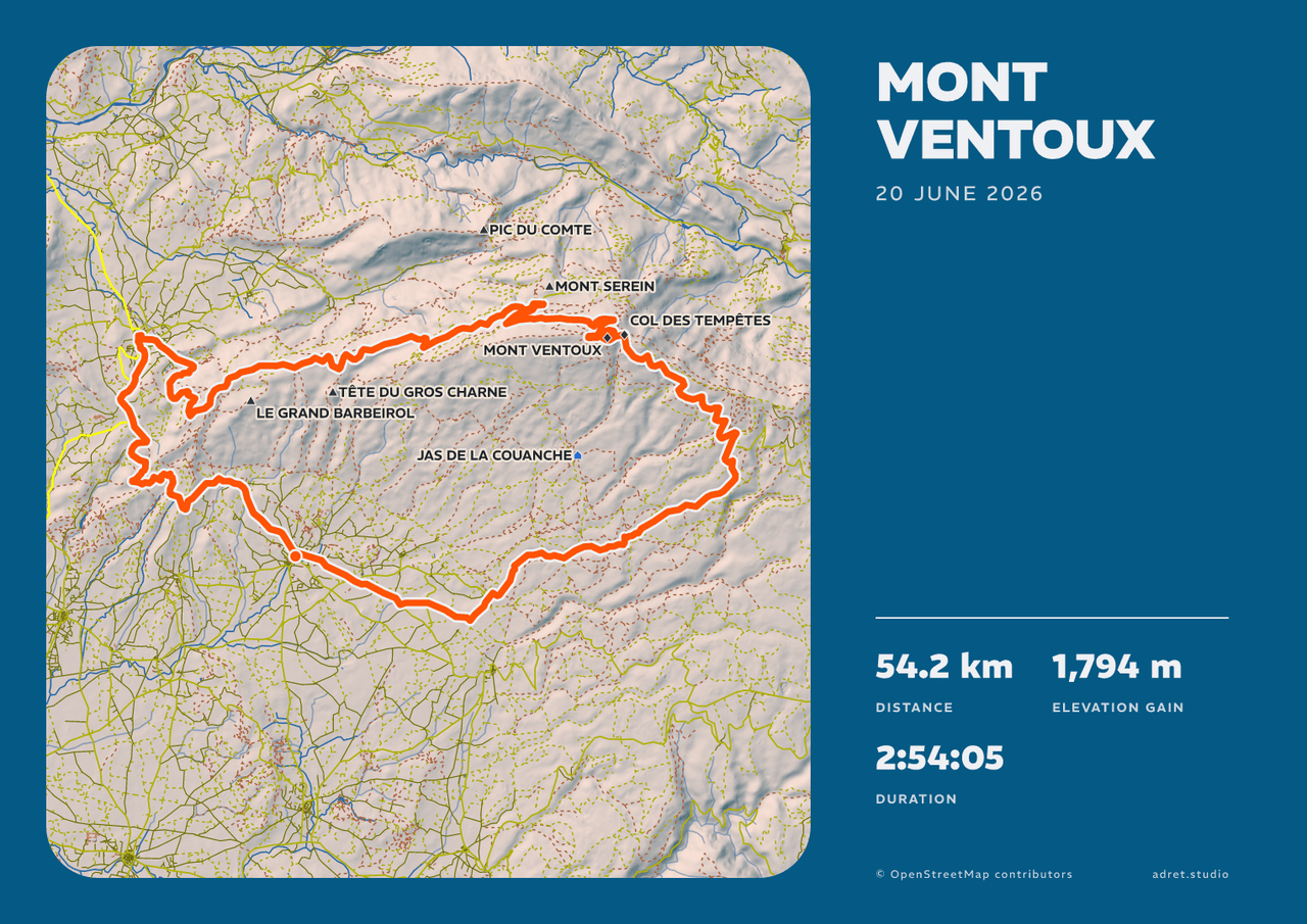
The house style, and what a first poster arrives in: shaded relief on a deep blue sheet, the route in orange.
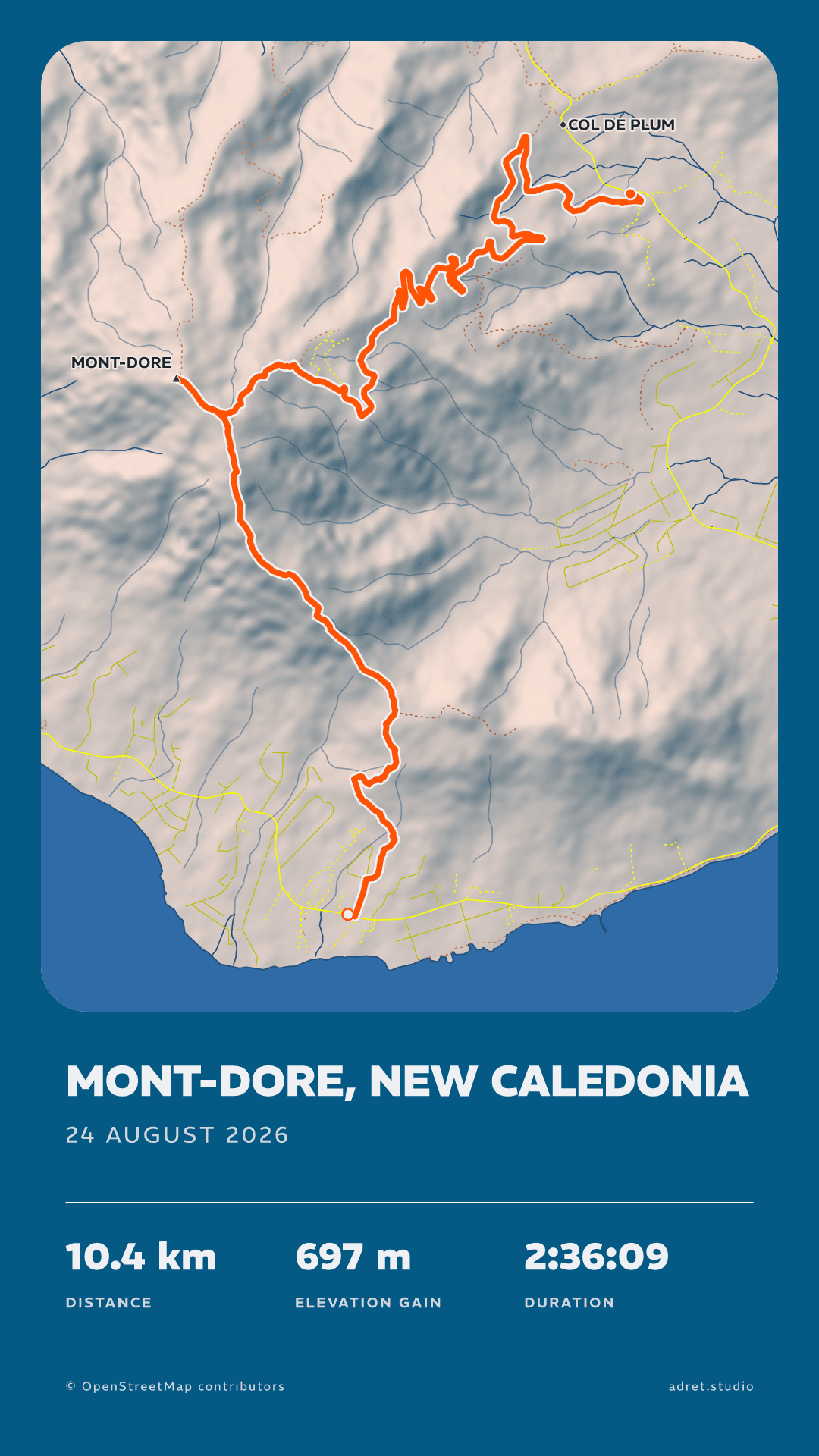
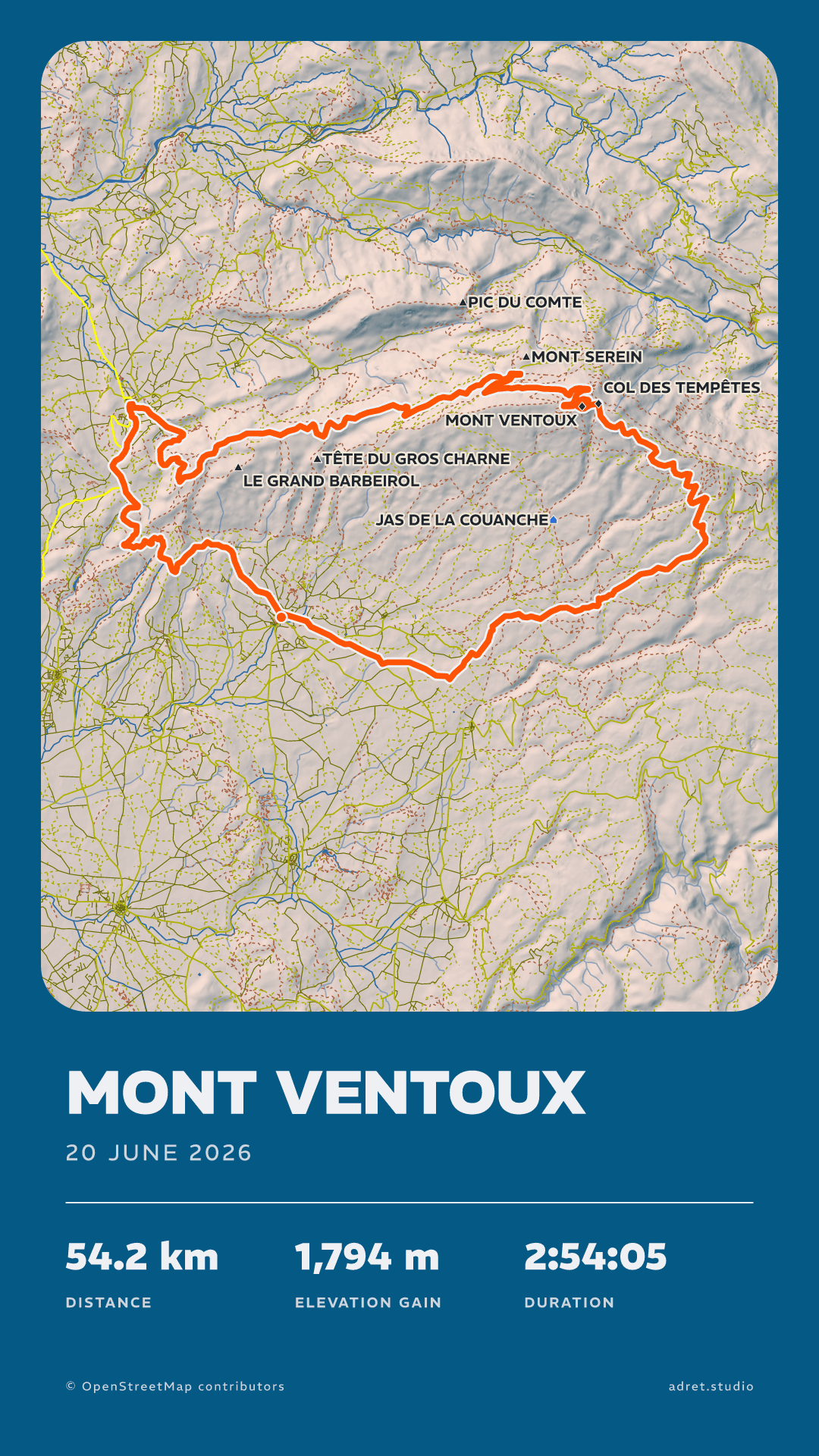
Each style is drawn here on two outings. Adret, Classic, Transparent and Vintage are free. Neon comes with Adret Pro.
Then make it yours.
Everything below is free, on any style. A change shows on the poster at once, and it is kept as you make it.
Colour
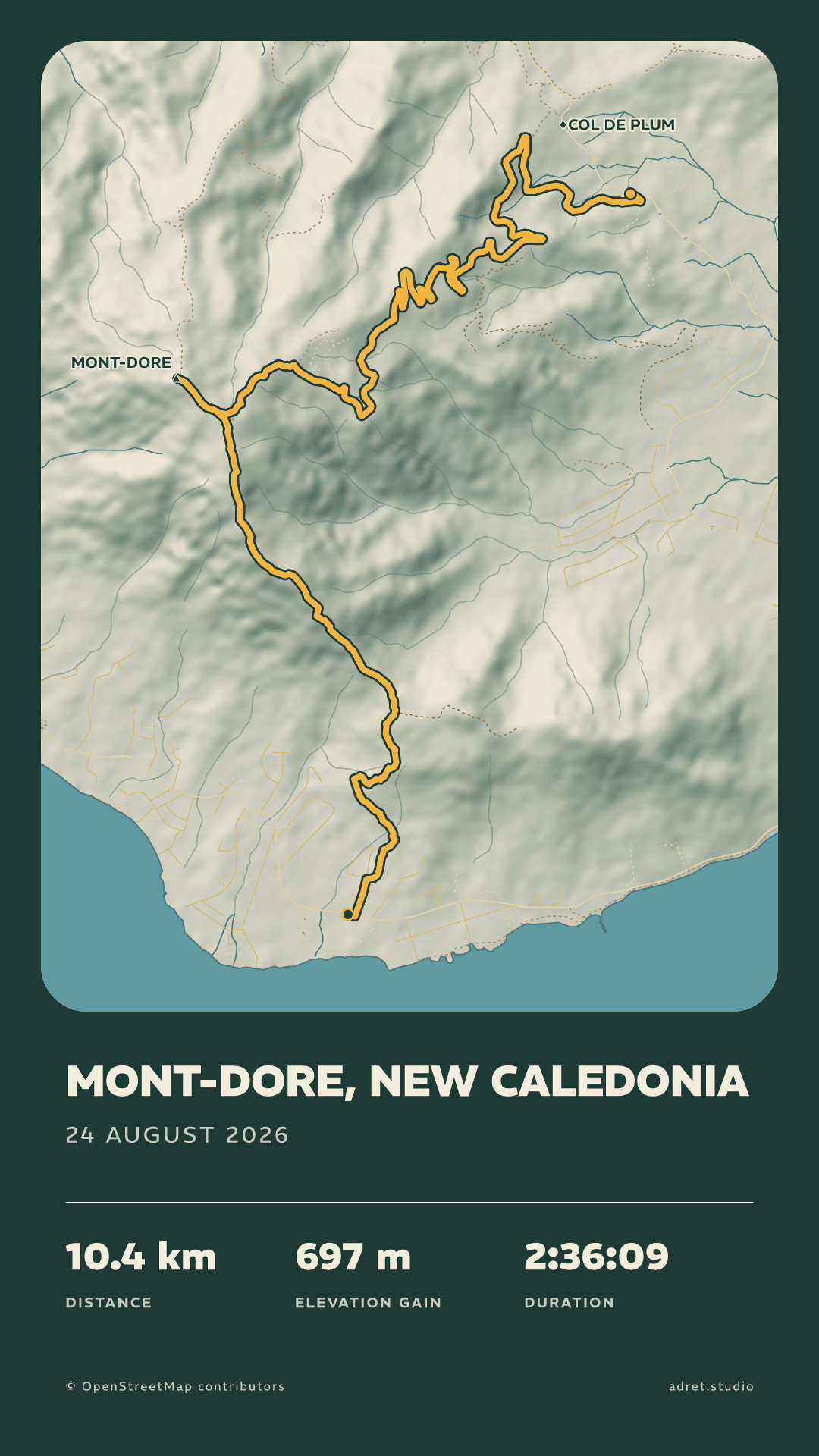
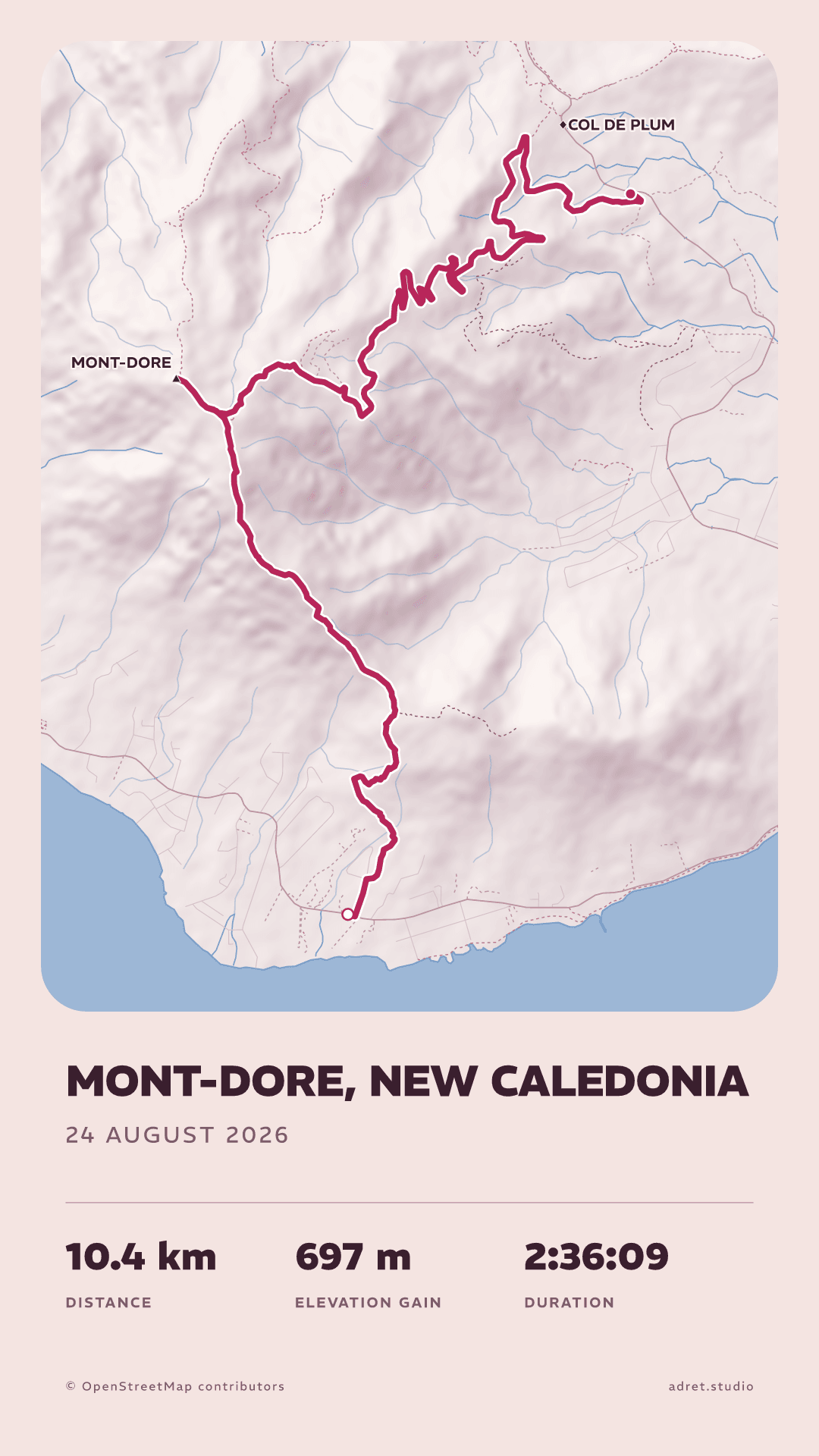
Every colour, from the track down to the background.
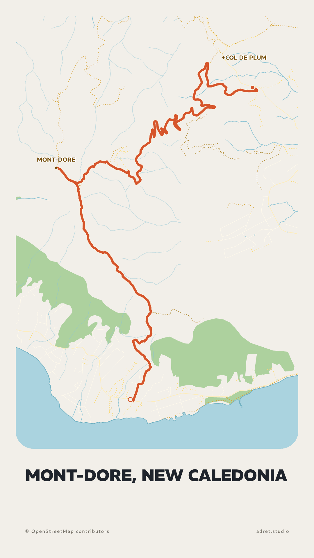
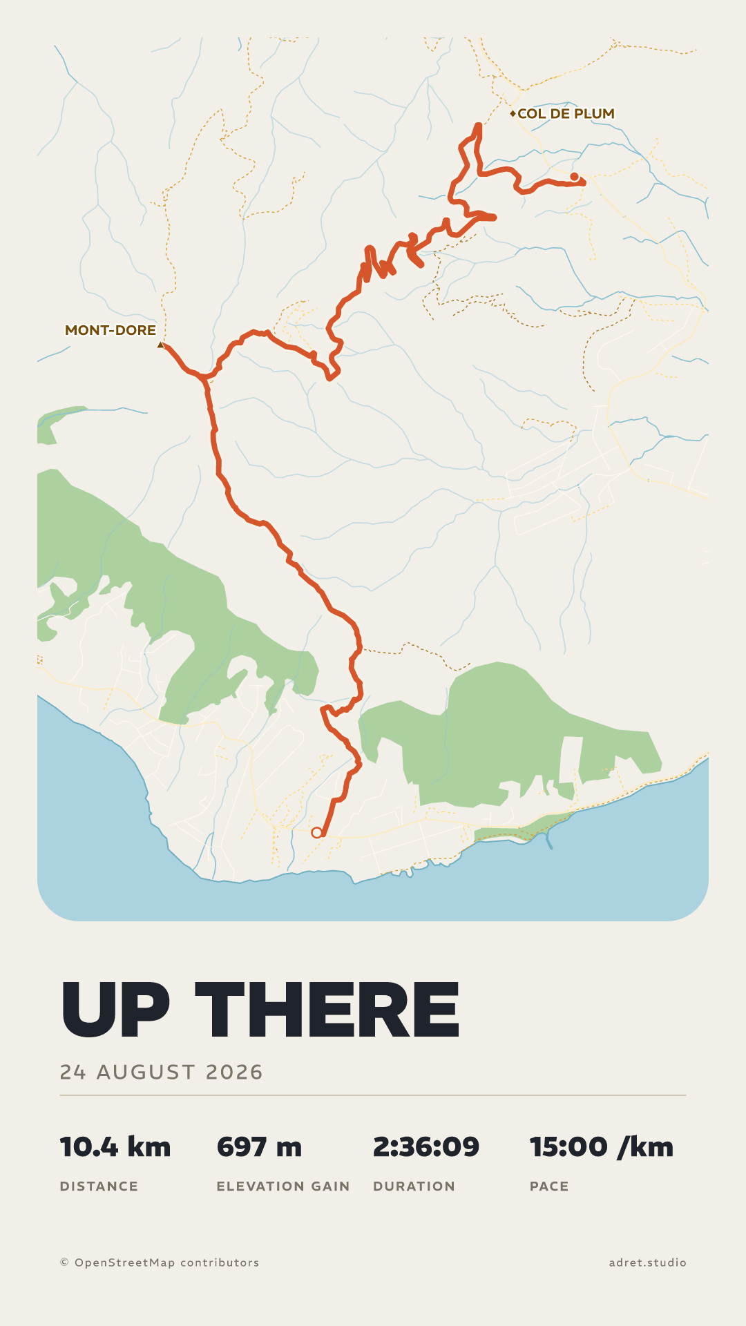
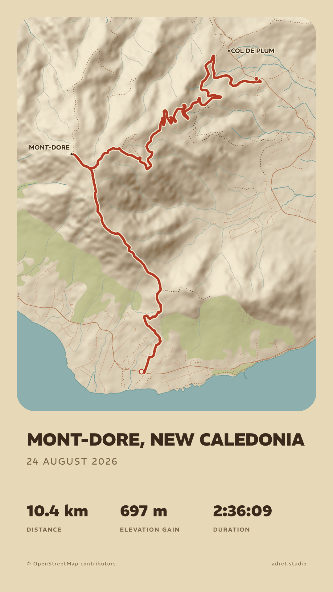
The sheet, the route, the water, the roads, the light and the shadow of the relief, the type: each has its own colour and its own opacity. These two sheets are one walk in one style, a few minutes apart.
Contents
Decide what the map draws.
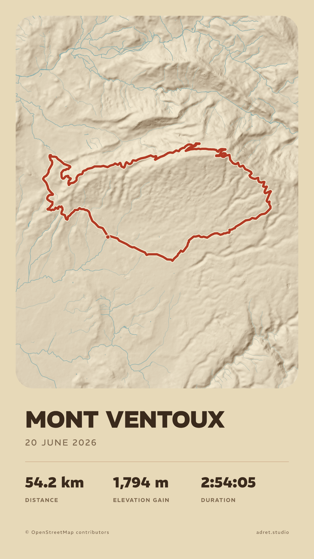
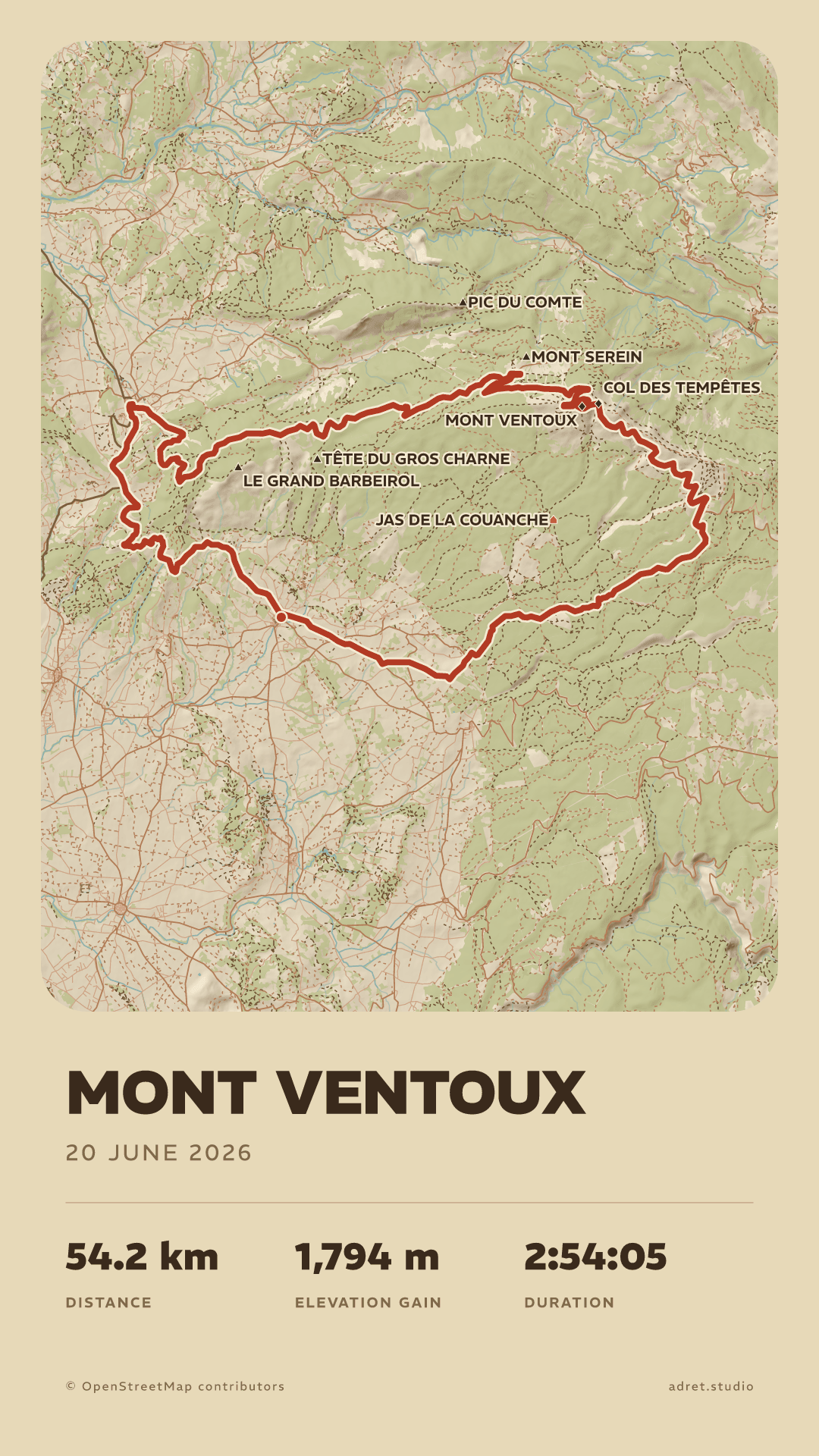
Mountain, town, or both. Then layer by layer: woods, roads, paths, summits and place names can each be shown or hidden, down to the relief, the water and the route alone.
Relief
Shaded or flat.
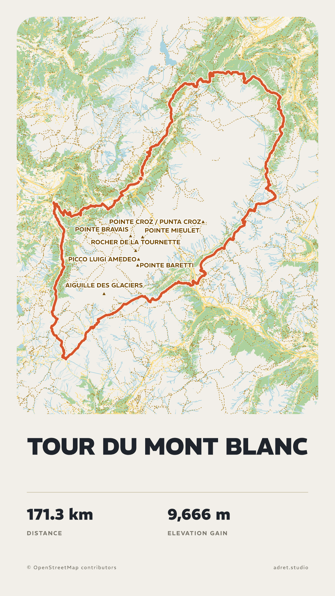
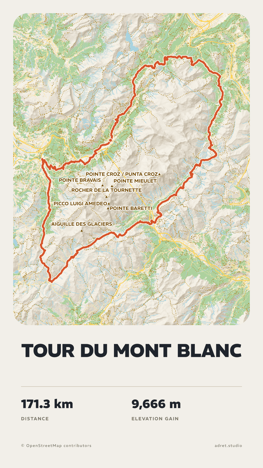
Shaded, the ground takes on volume and the climbs show before anyone reads a stat. Flat, the route and the type carry the poster.
Text
Your words, your stats.
Write the title and set its size. Keep the stats that matter out of distance, climb, moving time, total time, pace and average speed, with the date or without it, or keep none of them.
Format
Portrait or landscape.
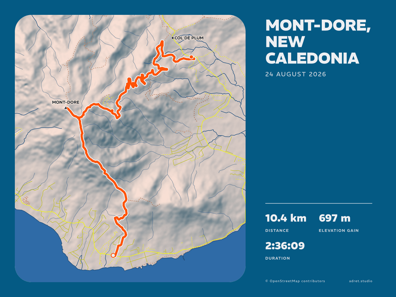
A story is portrait only. A post is portrait or landscape, and in landscape the map moves to the left, with the title and the stats in a column beside it. The same walk, twice.
Background
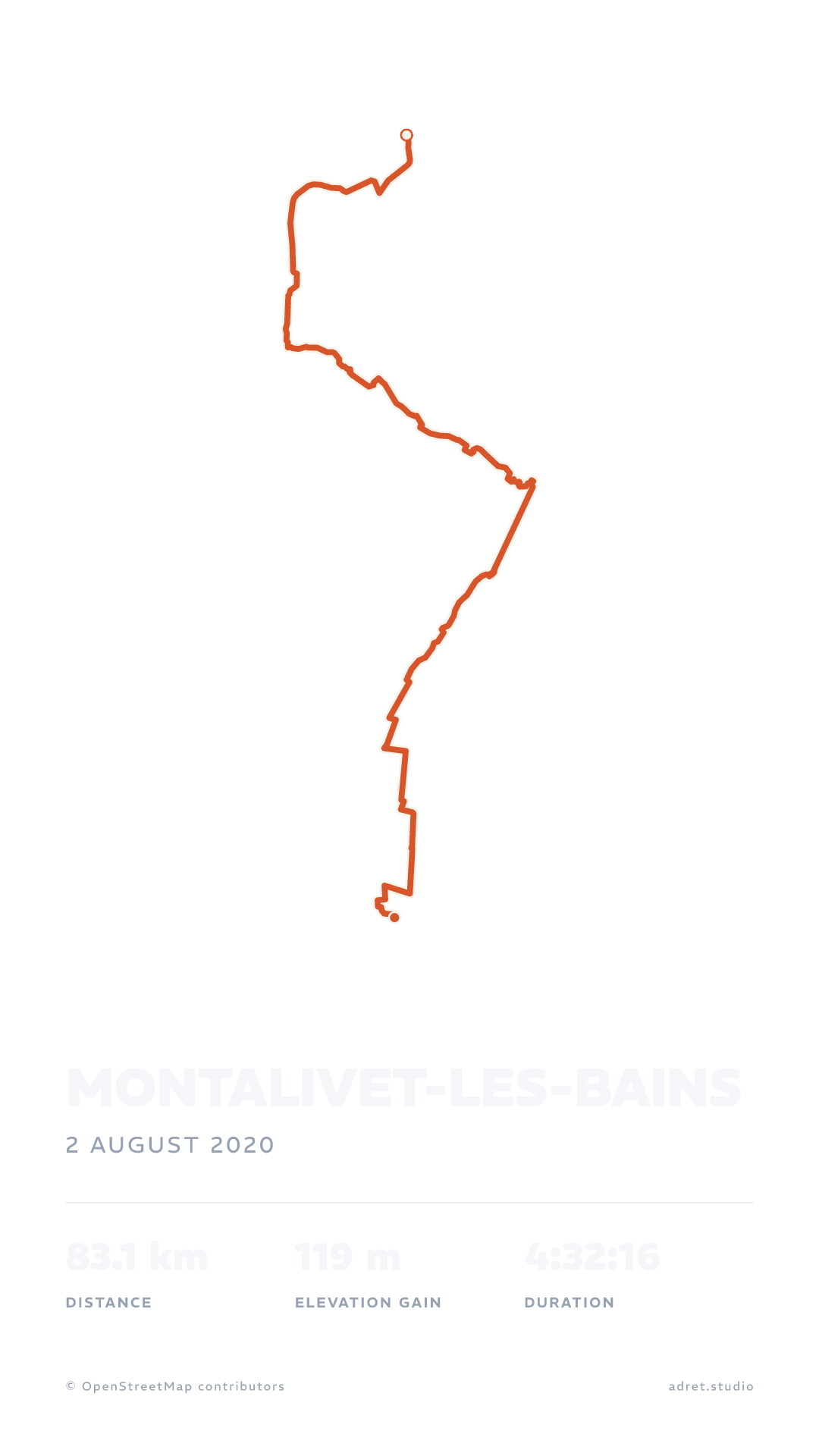
A transparent background, for a story.
Take the sheet away and the poster lays over a photo or a video of the day. Here it stands on the app’s chequerboard, then on a ground of colour.
Adret Pro, for the next one.
Making a poster costs nothing. Adret Pro is the rest of the art direction: where the sun stands, what the words are set in, how the sheet is composed, and a style that follows you from one outing to the next.
SunPro
Move the sun.
Eight bearings, three heights. Lit from the east with the sun low, the same mountain shows its other flank and the shadows lengthen.
FontPro
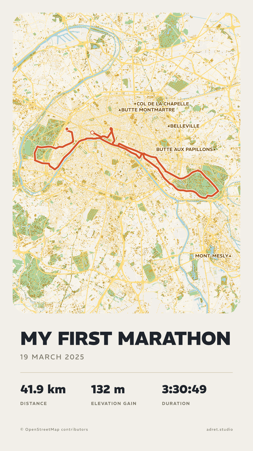
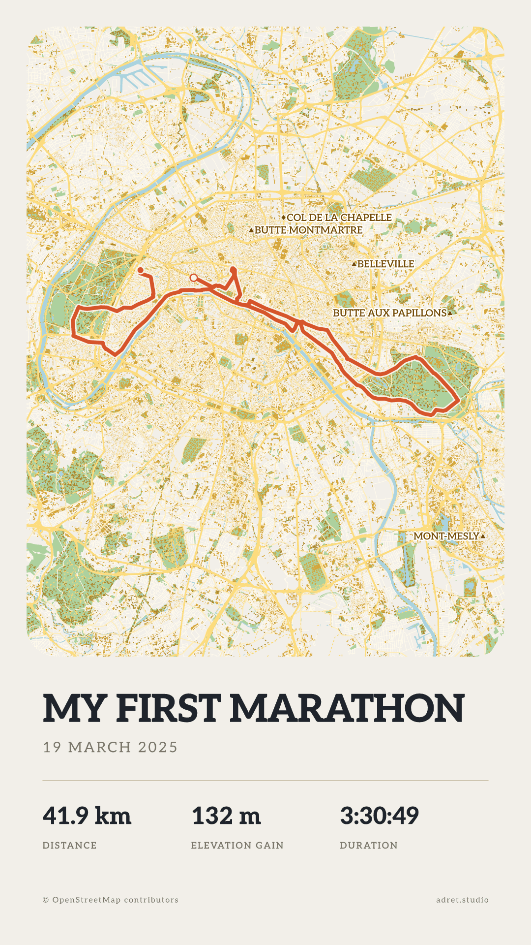
Every typeface, in every weight.
A free poster is set in REM, extrabold. Pro opens the other families and all their weights: here the same marathon in Aleo, a slab serif.
LayoutPro
The map across the whole sheet.
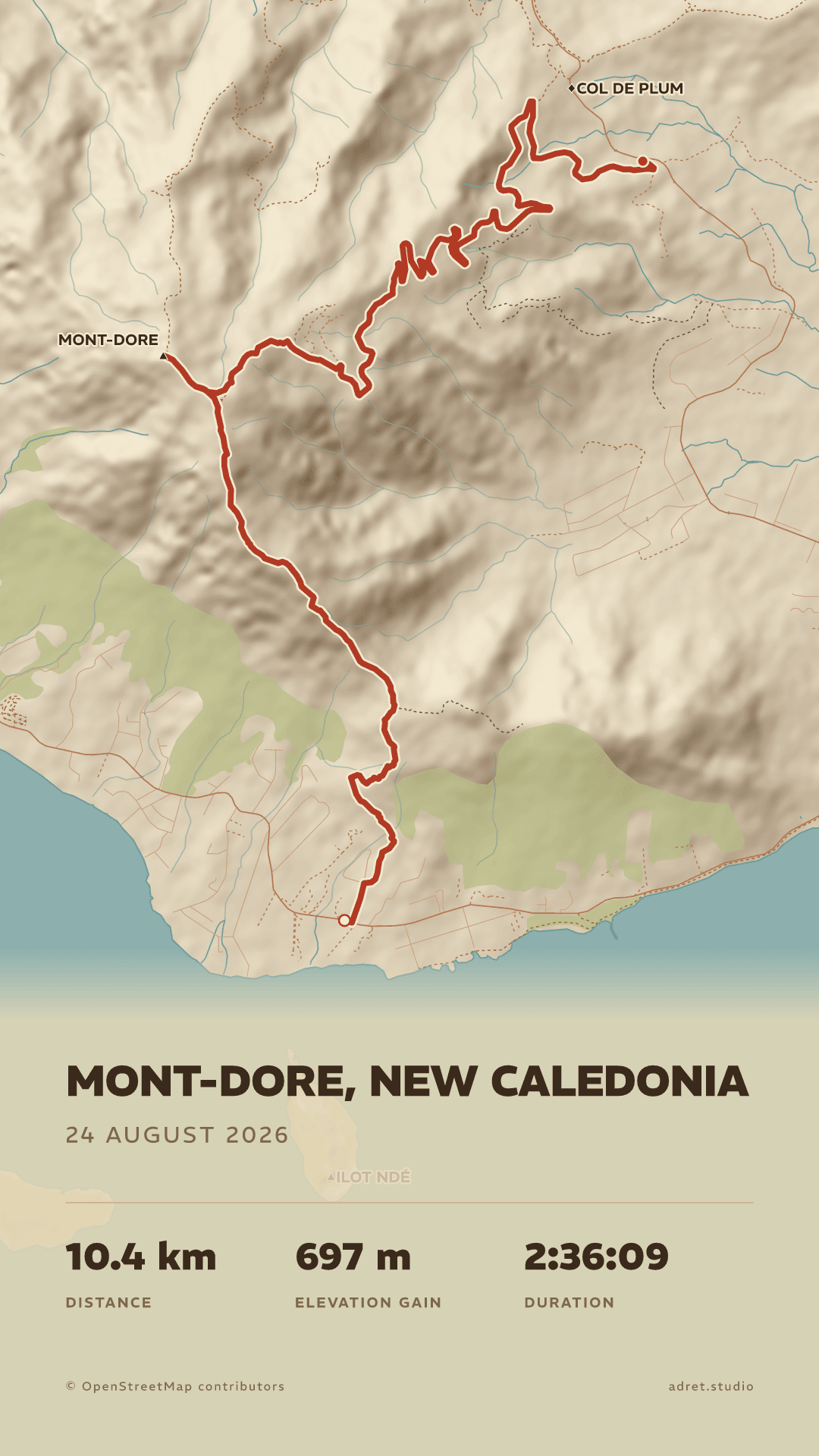
The free layout keeps the map in its frame, with the type under it. Pro opens the others, and today that is Cover: the map over the whole sheet, the title set on the drawing.
ElevationPro
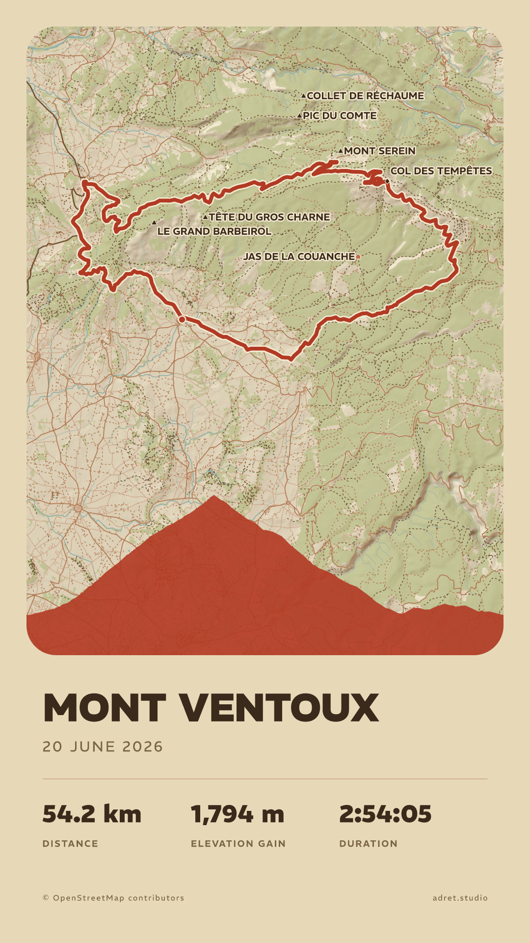
The route’s elevation, drawn under the map.
Every climb and every descent as one silhouette along the bottom of the map. On Mont Ventoux it is a single pyramid, and anyone who has ridden it knows it on sight.
PrintPro
A file to print, at 300 dpi.
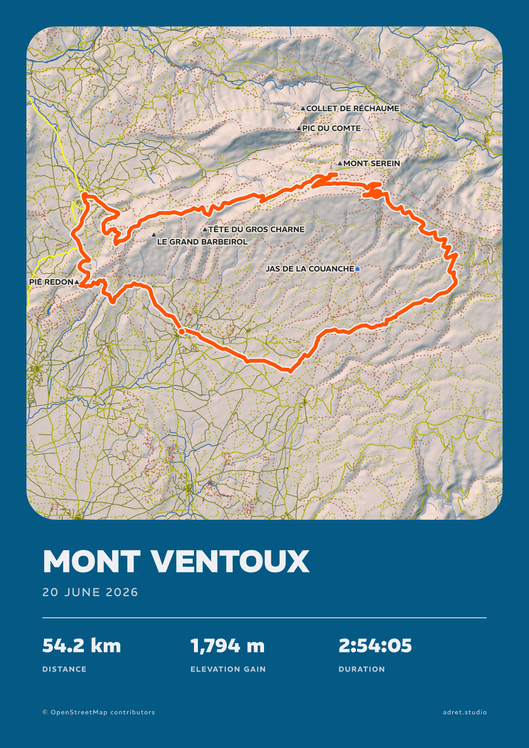
Give the poster a print format and its menu makes the file: A3, which prints just as well at A4 or A2 and fits a 50×70 cm frame, or 30×40 cm, which prints at 60×80 too. Portrait or landscape: here the same Ventoux both ways.
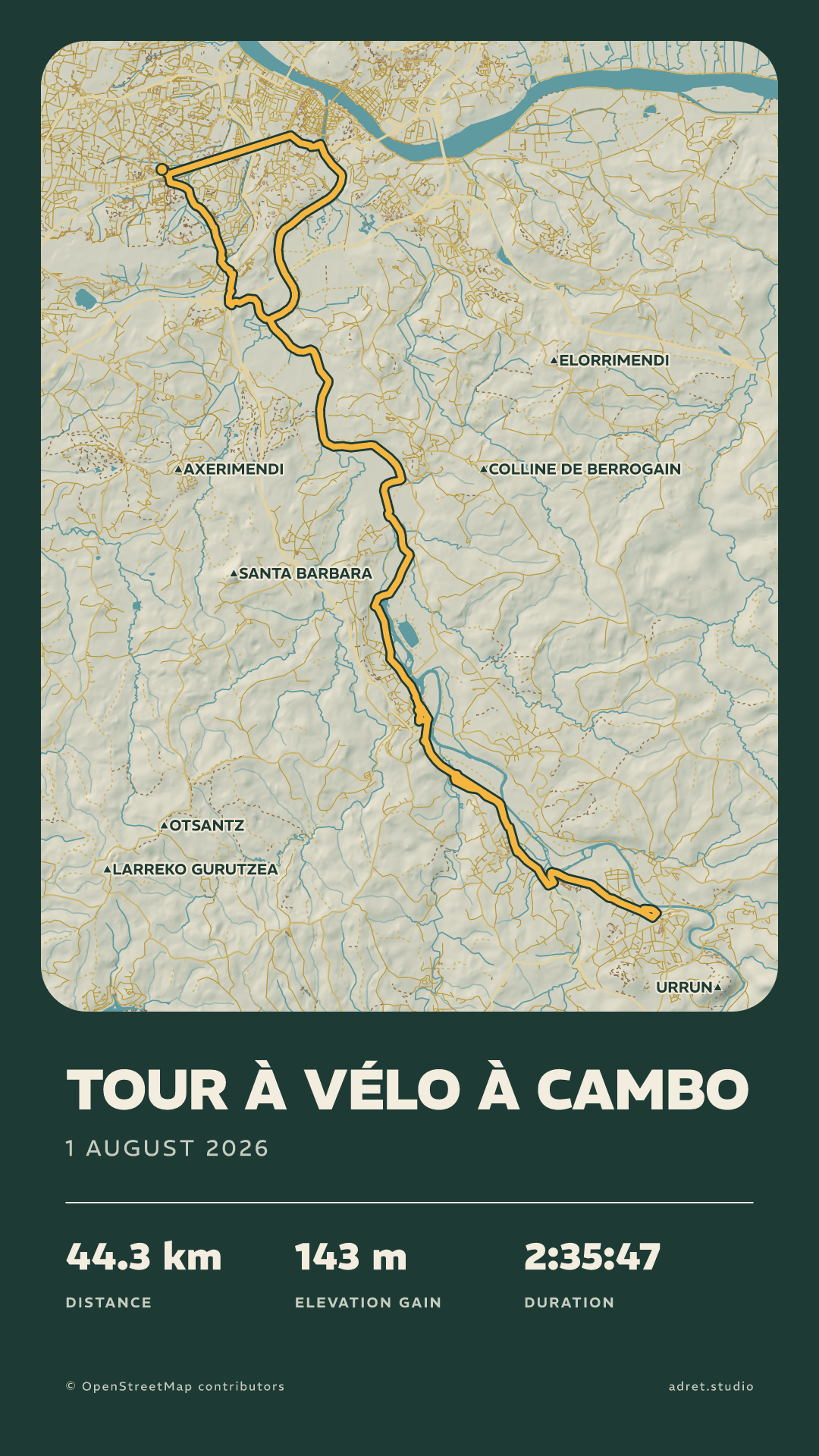
Saved stylesPro
Keep your style for the next outing.
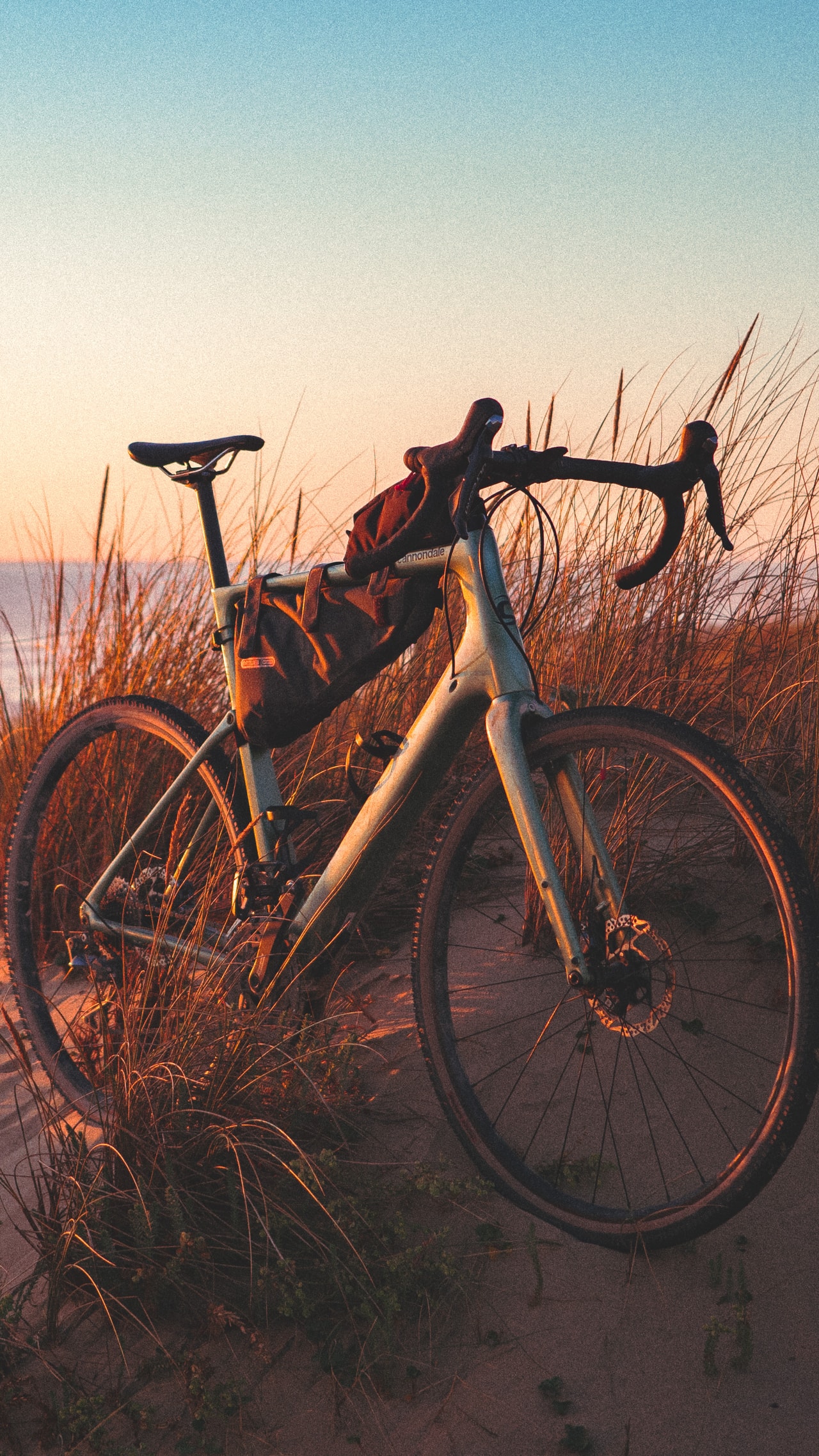
Save the look you built and lay it on any poster in one tap. This is the dark green sheet from further up the page, on another day and on a bike.
Adret Pro also covers long routes and multi-day trips, and many more posters a day.
Pick one. Make it yours.
Adret is on iPhone and Android: free to try, no account, no watermark.


On a computer? Scan to open Adret on your phone.