The story of a logo: the sunny side, the shady side and a coin cut in two
By Nicolas ·
Nine drawings, two detours and one curve.
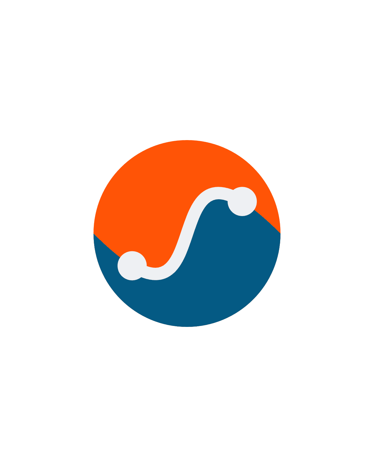
This is the first post on this blog, so it might as well start with the first thing you see: the orange and blue coin at the top of the page. Back in 2016, on my personal blog (in French), I told the story of another logo, version by version (it had to have orange in it). Ten years on, here we go again!
A word from the mountains
The adret is the side of a mountain valley that faces the sun. The side across from it, left in shadow, is the ubac. If you grew up in the Alps, you have always known that; if not, now you do.
The name came out of a brainstorm with Claude: a handful of ideas, and Adret is the one that stuck. It describes the app better than I can: every poster is lit by a sun, and the relief has a lit side and a shaded side (and in Adret Pro, you can move the sun).
So that is what the logo had to say. Easy to write, harder to draw.
Four directions
It all starts from a cut: one half in the sun, one half in the shade, in amber and slate. Four ways to draw it, all of them Claude’s: Illustrator is still closed.
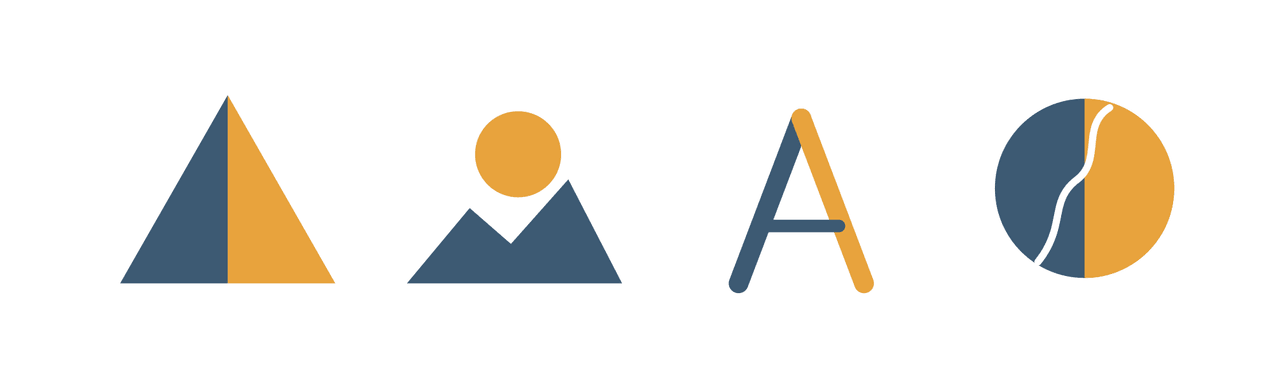
- The slope, a triangle cut in two. The most direct, and it holds up as a favicon (the little icon in a browser tab). Also the most common: two-tone triangles are everywhere in outdoor brands.
- The sunrise, a sun above two peaks. Warmer, but it is the cliché of the genre.
- The monogram, an A. An app icon you would recognise, but all it says is the name.
- The trace, a disc cut by a line.
I kept the trace. It is the only one that shows the app rather than just the name: the cut disc is the relief, and the line is your outing.
Dots on the line
Second series: dots on the line. A start, a stop, a finish, and a decorative line becomes a route.
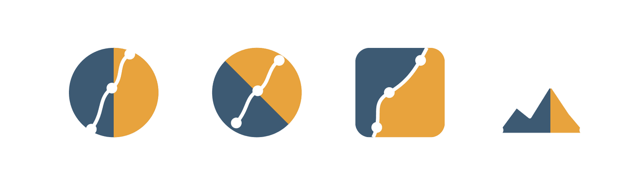
That is where it tipped. In the dividing line, the trace no longer sits on the shape: it is the border between shadow and light. The name, the app and the logo say the same thing in a single stroke. Kept!
Two detours
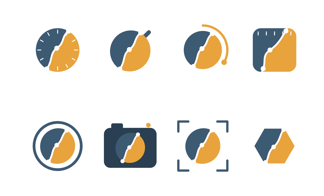
The stopwatch. Every outing gets timed, so why not a dial around the trace: tick marks, a crown, an arc of time, a watch case. Dropped: Adret does not measure time, it stages an outing that is already done. A stopwatch tells the story of effort in progress, and that is what sports apps are for. Wrong signal.
The camera. What the app hands you is a poster, which is to say a picture, so why not a lens, a camera body, a viewfinder, an aperture. Dropped as well: a two-tone slope, a dotted trace and a camera make three ideas stacked on top of each other, all fighting for attention. The trace as the border between light and shadow is enough to tell Adret’s story.
Hello, orange
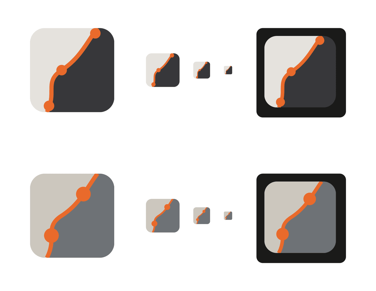
Anyway. Back to the trace on its own, and a new palette. The amber and slate were fighting the white of the trace. With two greys and an orange trace, it is clear: the grey is the scenery, the orange is the subject. Fair enough, since the subject is your trace.
Then the test that hurts: shrinking it. A logo also lives in a browser tab, at 16 pixels. At 32, the three dots clog the line; at 16, you cannot make anything out. The light grey vanishes against white, and the gap between the two greys is too harsh.
So the greys move closer together, and the logo stops reading as two blocks stuck side by side and becomes one surface lit at an angle, warm on the left, cool on the right: low sun in the mountains. Two dots instead of three, the start and the finish (three dots meant stages, and the app has none). The dots grow to a radius of 14 against a line 8 thick and sit on the curve itself: proper waymarks rather than bumps. And the trace runs on to the edges, carrying on out of frame.
At 32 pixels, it reads. At 16, the orange diagonal is still there. Phew!
The vertical S
One last try: the trace comes in on the left edge and leaves on the right. The reading changes completely: instead of a slope seen face on, you get a hillside seen from the side, with the light above it. Closer to real terrain, and livelier. But the more the trace crosses horizontally, the flatter the curve gets, and the less room there is for a proper S.
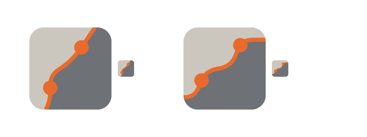
The vertical S holds at every size and keeps a firm curve; the crossing one has more movement, but its light side swamps everything. The vertical S goes on the icon, and the crossing one will wait for the site or a page background, somewhere with room for it.
The series ends on a grey rounded square, an orange trace, two dots, and a to-do list, including this: "Test in pure black and white. A good logo survives a fax."
One curve
Then I finally open Illustrator and go back to the disc of the first series: a coin cut in two by a single curve. I try the trace in several orientations, then simplify the path, with guides so the angles land exactly right.
For the colours, I turn to Adobe Color. I need an orange and a blue that hold up on a white background as well as a dark one (a light grey vanishing into white: been there).
Above the curve, the lit face, in orange: the adret. Below it, the face in shadow, in blue: the ubac. And the trace follows the curve, in white, with a dot at the start and one at the finish.
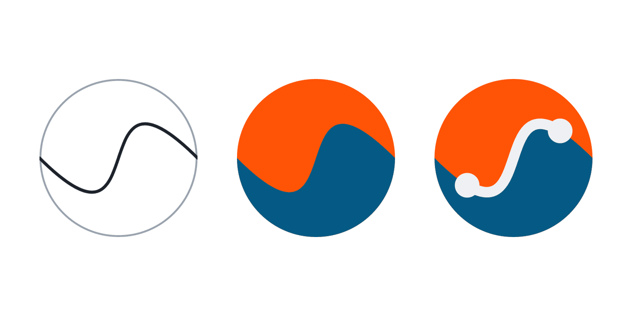
The same curve does everything: it divides light from shadow, and the trace follows it. And it comes in on the left edge and leaves on the right, with the light above. The crossing, after all.
Colour on both sides and a white trace down the middle is also what I had dropped at the start, only bolder. Fine.
Then it moves fast. The logo goes into the project. It replaces the site’s icon. It becomes the app’s icon and its launch screen. Its two colours become the app’s.
Logo adopted!
All that way to get back to the disc from the start, with the right curve this time. And ten years after the 2016 logo, still orange.
So, which are you: adret or ubac?
Nicolas